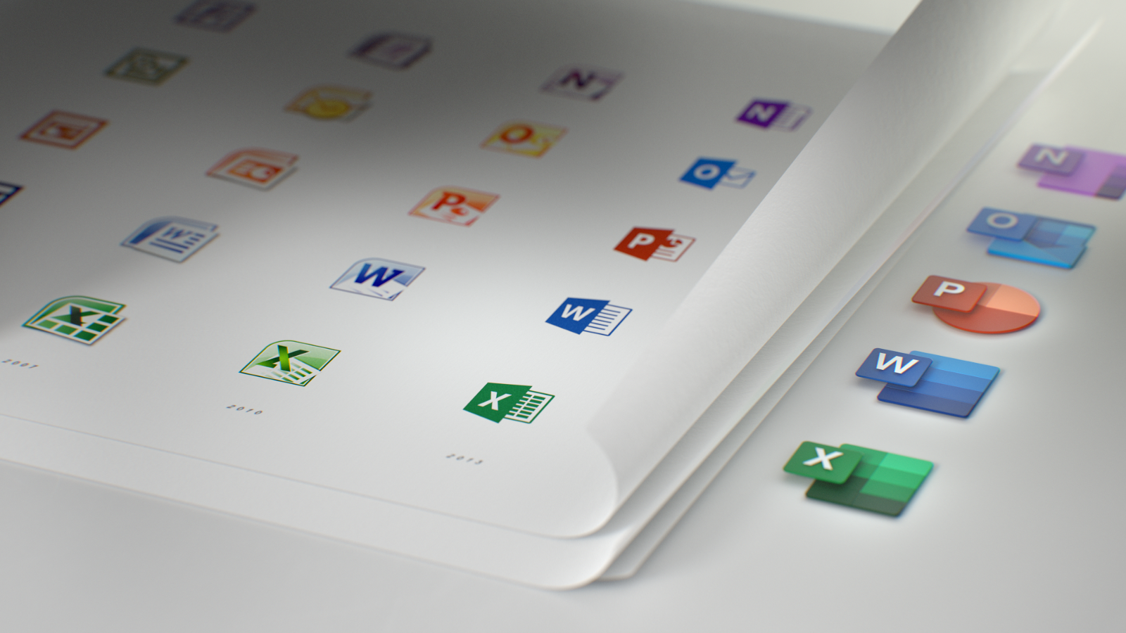
Microsoft revealed new icons for its Office suite a few days back, and the last time they redesigned the icons were five years back.
As Office 365 transforms into a more collaborative suite and introduced AI technology and chat service called Microsoft Team, Microsoft also decided to revamp the Office icons to represent the transformation that Office has gone through throughout the years.
It is undeniable that the new icons actually look more futuristic, as Microsoft decided to separate the symbol and the letter in each icon, adding some shadows and depth, resulting in the new icons getting a 3D look. Microsoft also said that the new designs are made to honor heritage while welcoming the future, which is probably why the icons are new yet familiar at the same time.
[youtube https://www.youtube.com/watch?v=YplAU5myNP4]
The designs adopt new hues without changing the main colours, and lost the traditional tool formatting. “Whereas prior Office icons had a document outline for Microsoft Word and a spreadsheet outline for Excel, we now show lines of text for Word and individual cells for Excel,” said Jon Friedman, the Head of Microsoft Office design. In addition, the letter-to-symbol ratio has also been readjusted whereby the symbol is emphasised instead of the letter as Microsoft believe that the symbol speaks more to people’s creations.
Microsoft also announced that the new Office icons are a part of the company’s major overhaul of Office as a platform. In the video above, Microsoft also showed some changes in design when it comes to Windows 10’s icons, which led to many speculating that the Windows 10 will soon follow Office’s footsteps in getting new icon designs. While there is no confirmation on whether the icons for Windows 10 will be coming, Friedman has already announced that the new icons for Office 365 will be rolling out in the coming months, and the update will first appear on mobile and web.

