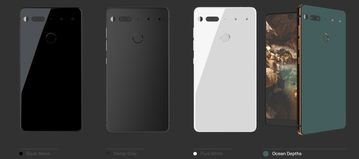
The hype for Andy Rubin’s Essential Phone has pretty much died down since its launch. The first ever smartphone by the Android co-founder’s company Essential has its public release pending ever since. Regardless, the Essential Phone is definitely a device not to be missed out on, featuring a very impressive and high end spec sheet.
As bezel-free as the front display looks pleasing to the human eye, the front facing camera cut out at the top middle of the display is definitely far from conventional, unlike the trending near bezel-less displays seen on the Samsung Galaxy S8 and the LG G6. This brings us to the question on how will the display interface look like for users.

Essential’s Head of Sales Jason Mackenzie posted a screenshot of his Essential Phone, promoting the device itself to fellow Twitter users, giving us a tiny glimpse on what would the controversial display look like. It turns out that the interface of the Essential Phone features a larger than usual status bar as compared to regular Android phones, to compensate for the selfie camera cut out in the middle.
While the unusually large status bar might not be persistent throughout the operation of the device, the camera cut out at the middle might be a distraction especially during media consumption. That doesn’t sound like good news to Essential or its potential consumers.
Would you sacrifice your media consumption comfort for a “revolutionary” display design of the Essential Phone?

