We’re at a point where the smartphone market is so oversaturated, it takes something really special for something to stand out — the Vivo Y17 is no such device. See if you can tell what phone this is — 6.53-inch panel, dew-drop notch display, MediaTek Helio P35, 4GB RAM, 128GB internal storage. That’s right, this describes the Vivo Y17 as well as every other low-midrange smartphone since 2018.
If the specs don’t excite you, I reckon watching paint dry would — eventually. It’s not like Vivo can’t make good phones — the Nex, V15 and V15 Pro were fantastic devices; but if we could rewind time, I would advise Vivo against even conceiving the idea of the Y17.
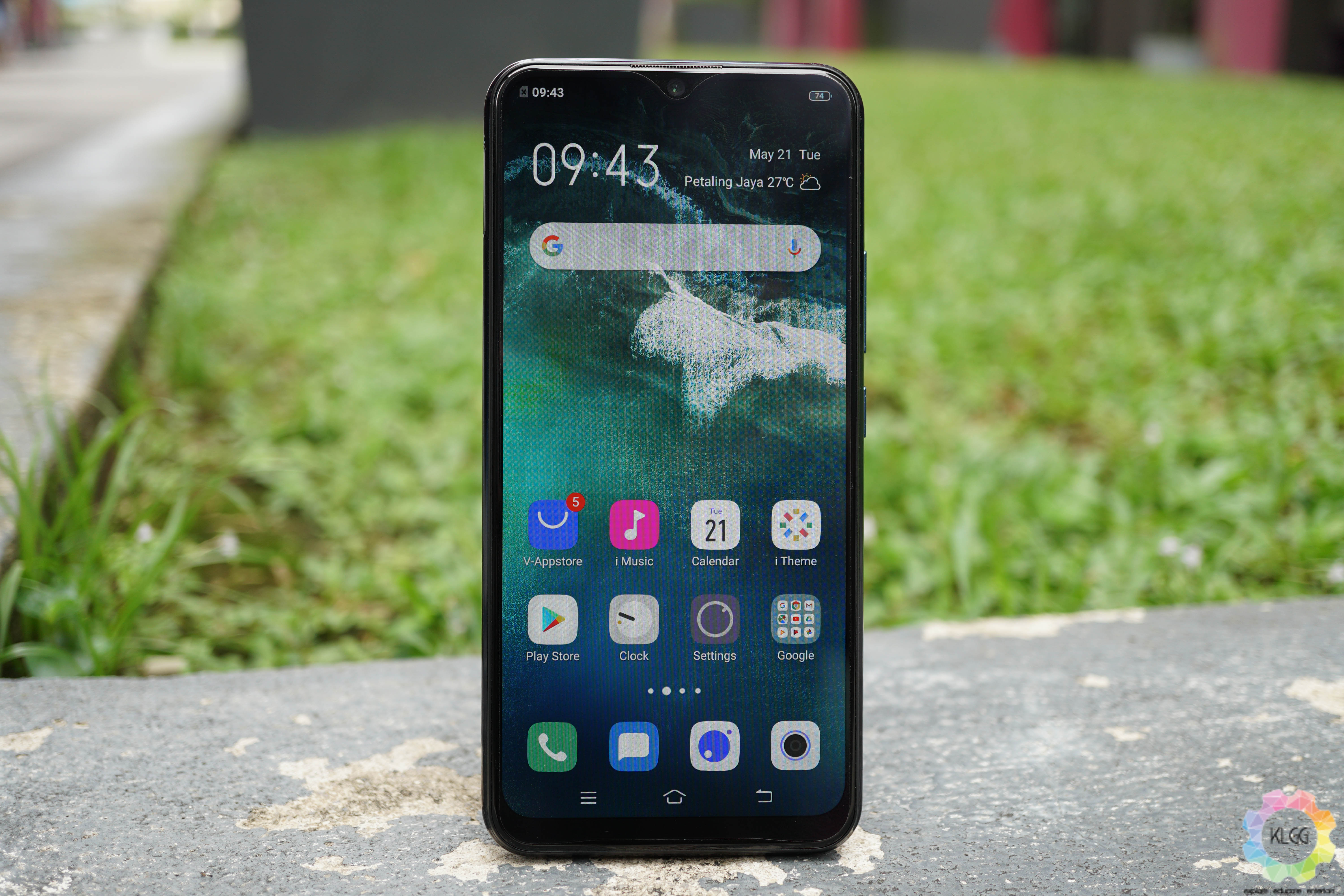
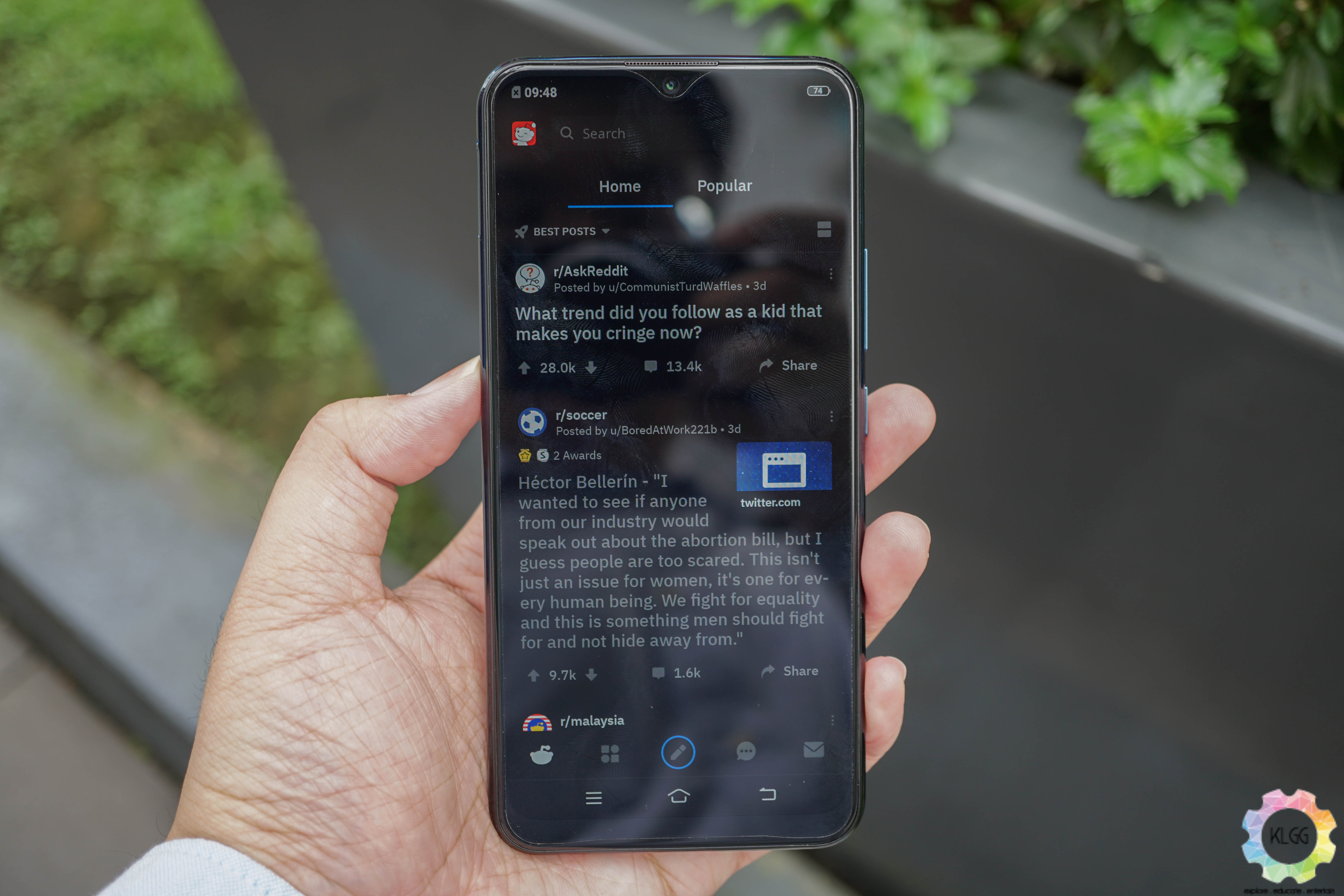
But I digress, let’s begin by talking about the display — here’s one of the few impressive qualities of the phone. The 6.43-inch LCD Halo FullView dew-drop display is crisp despite only pushing 720p HD+ resolution; while brightness is also great. When combined with its fantastic colour production, the display on the Y17 is akin to something more premium.
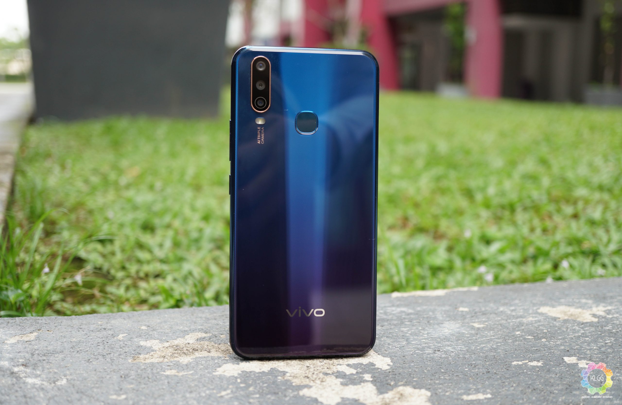
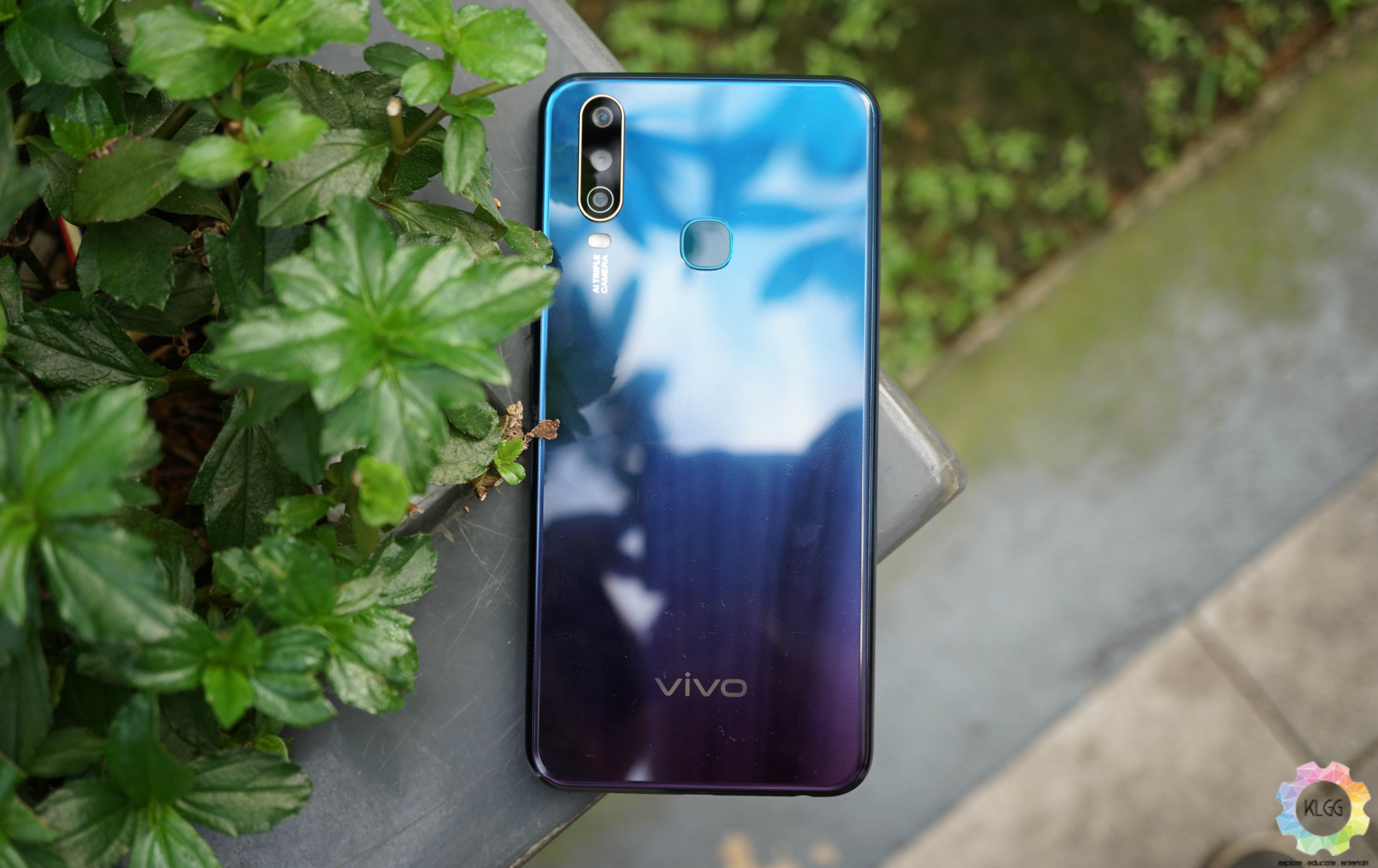
Moving to the back, you’ll find a glossy glass-like gradient back panel that doesn’t really stand out but isn’t the worst either. The camera module is accented with champagne gold which adds an extra touch of class to the overall look.
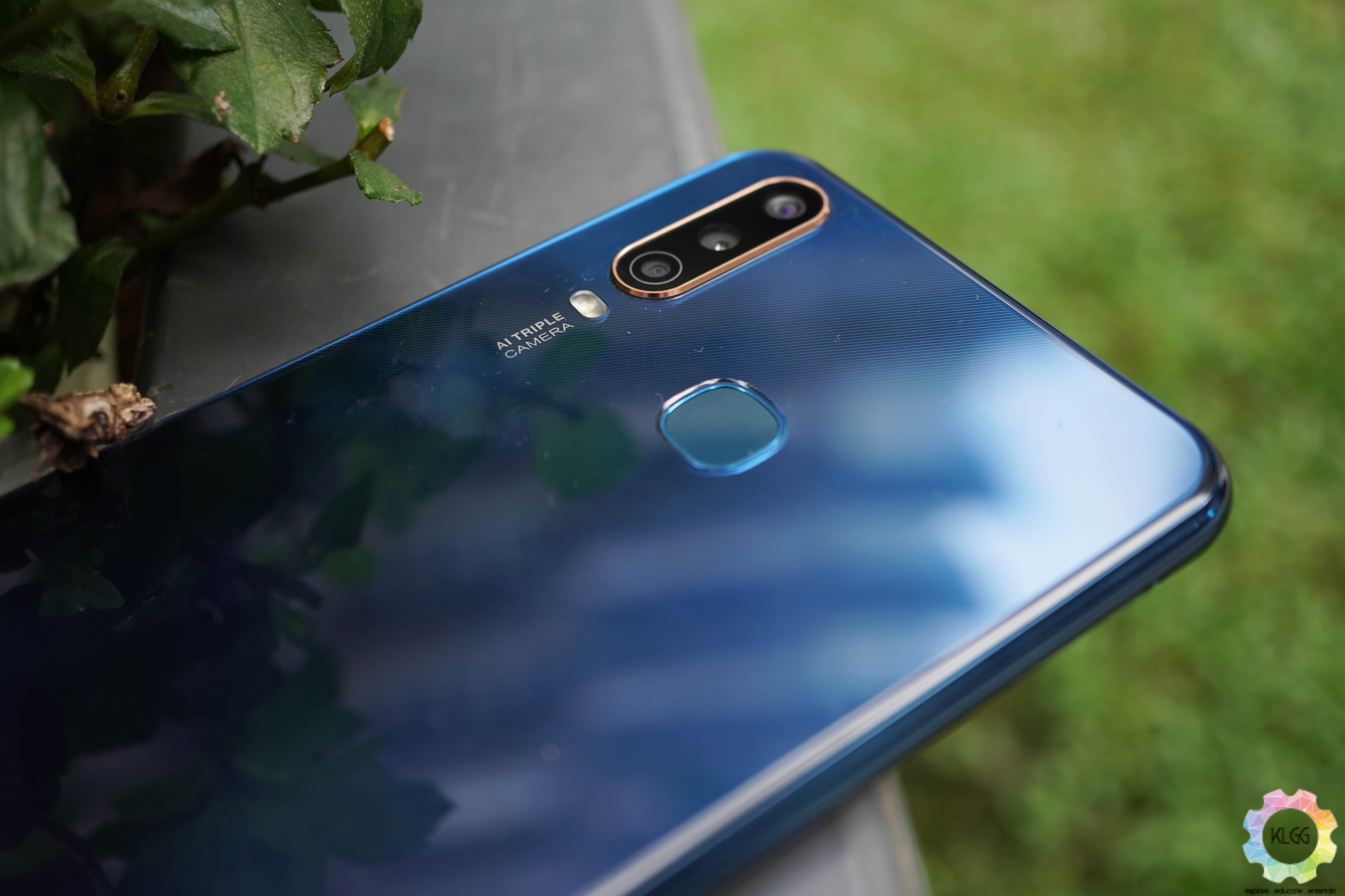
However, the phone is thicker than many phones in its class measuring at 8.92mm, while the phone weighs a whopping 190.5g, which is also mighty heavy – there’s a reason for this, but we’ll get to that later.
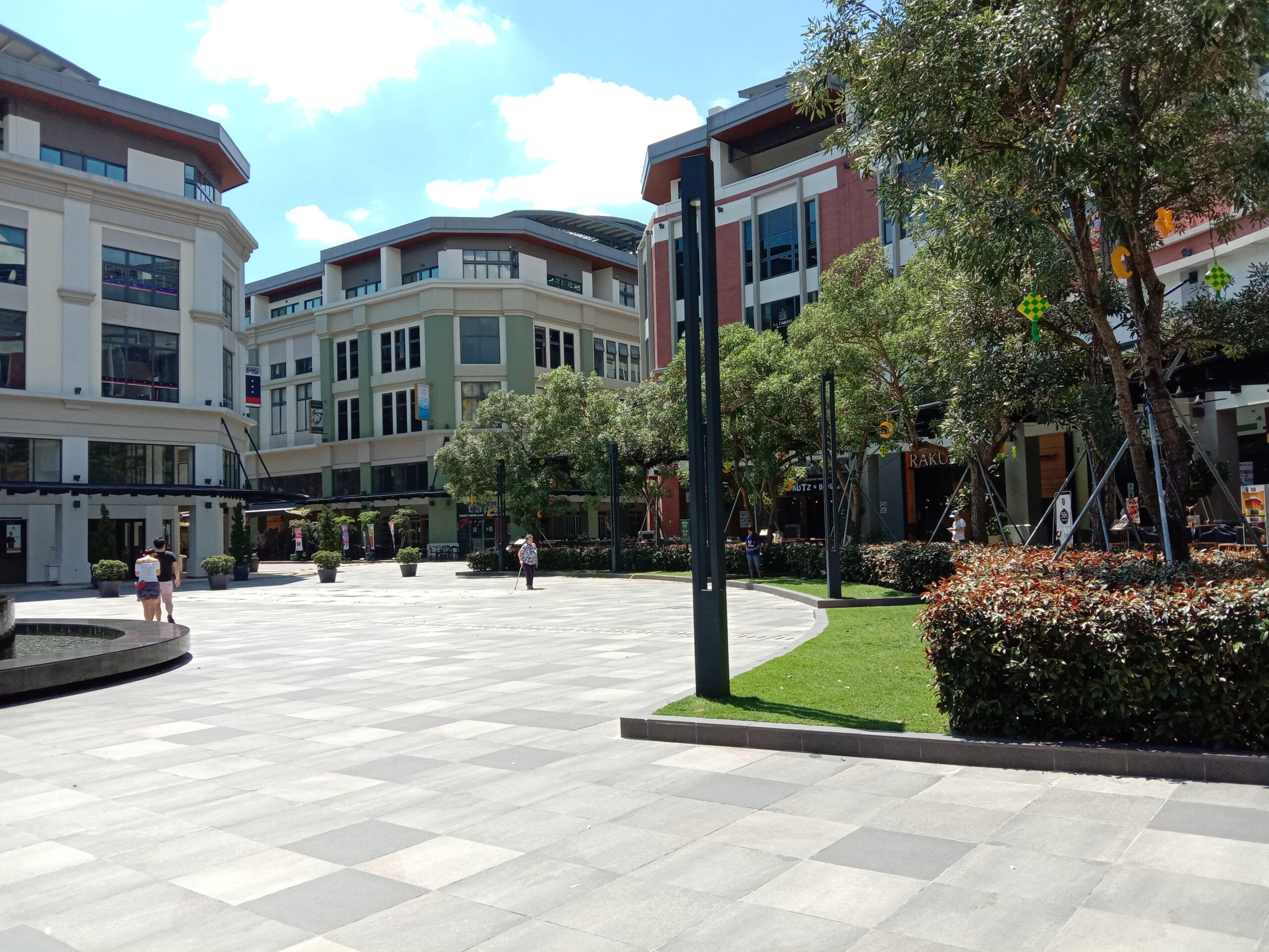
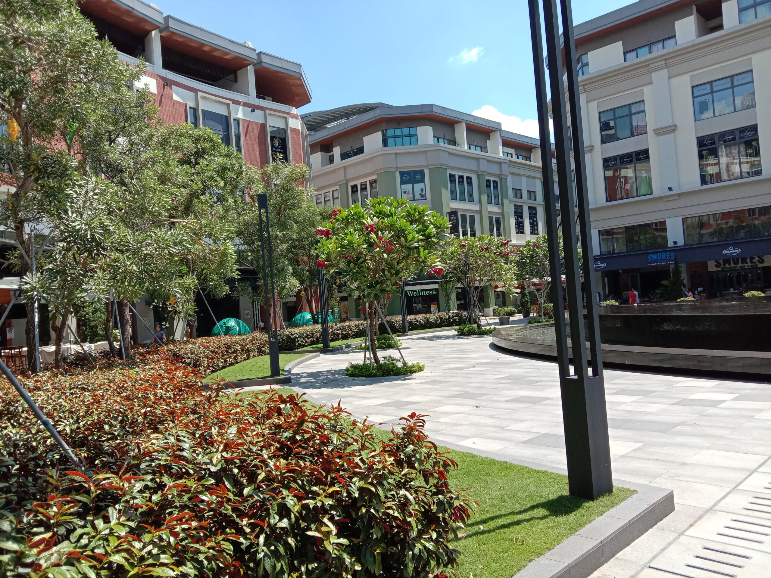
Speaking of the camera, the Vivo Y17 gets a 13MP main shooter, an 8MP super-wide angle lens and a 2MP depth-sensor — three lenses in this price range is a bit of a commodity and they’re decent. Day-time photos were okay — it takes due diligence to get the focus right, but at least the colours are somewhat natural.
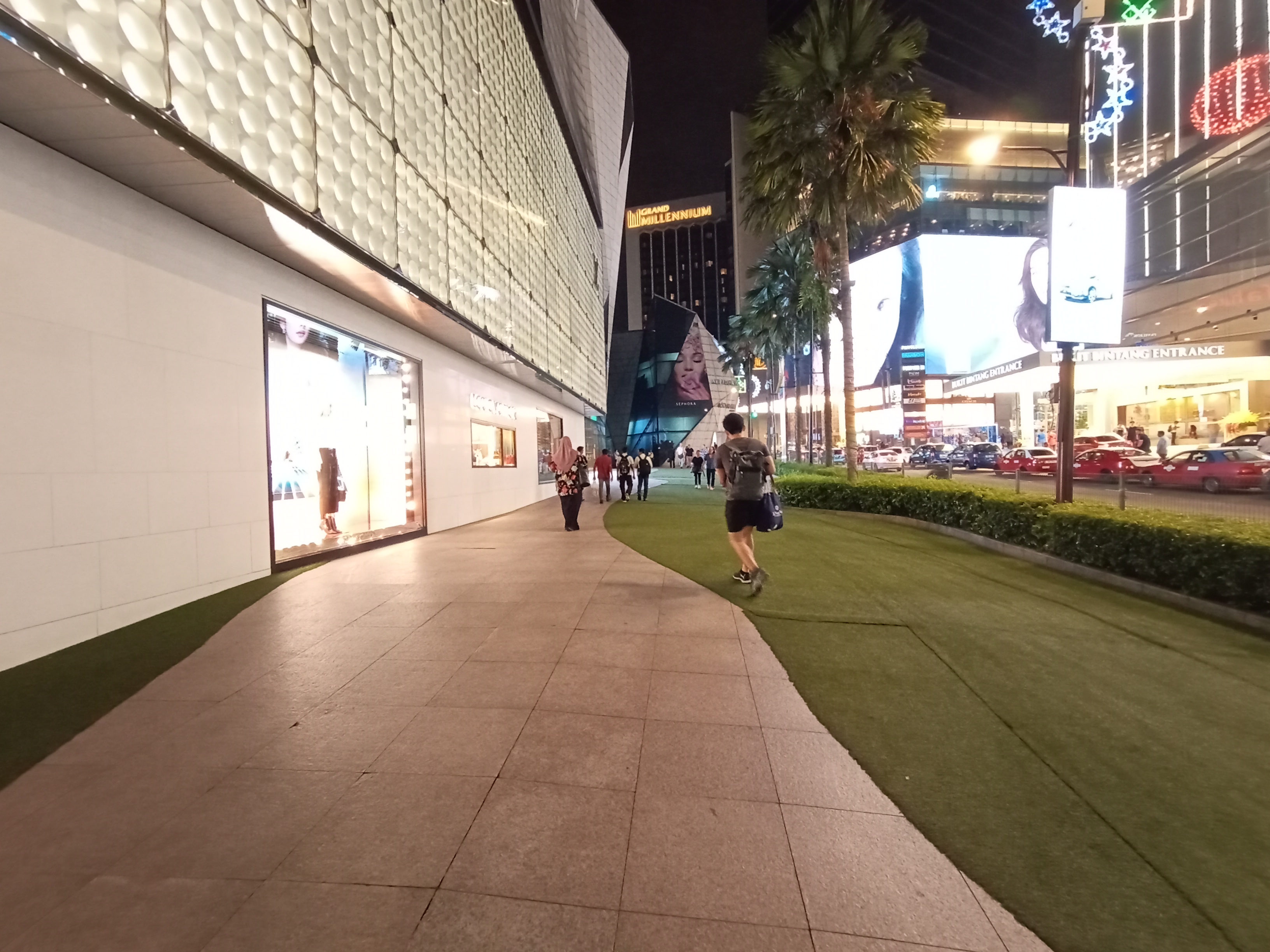
Portrait mode on this phone is your standard low-midrange affair, and again it takes some patience to get the snaps that you want. The super-ultrawide lens is good addition does its job well. Night-time shots however leave little to be desired; noise and grain present despite the subject being relatively well-lit. There’s also no night mode to speak of, so you’d want to avoid low-light photography with this.
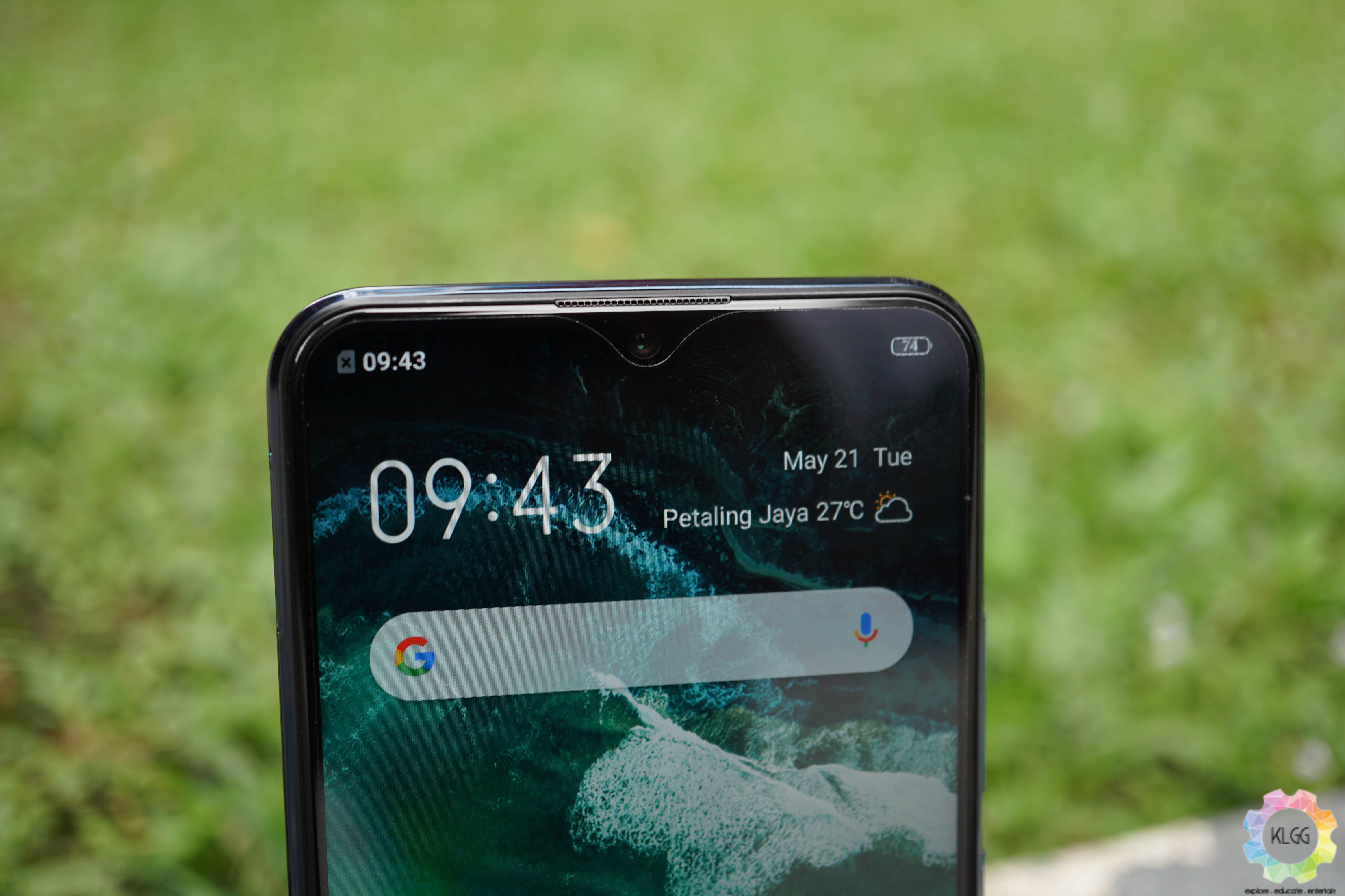
The 20MP selfie camera is also pretty good. The lens performs spritely and the AI beautification is decent, albeit basic when it comes to modes.
Going back to the back camera, the native app itself is an issue — we find it to be laggy during mode transitions as well as delays in what shows up on screen when moving. We suspect this is due to the Y17’s underwhelming chipset.
The phone’s MediaTek Helio P35 just doesn’t cut it — especially when you take into account the Vivo Y17 costs RM999 (let’s call it RM1,000). Competitors like the Realme 3 Pro get a Snapdragon 710, Honor 20 Lite with its Kirin 710 and even the Redmi Note 7 feels nippier than this with its Snapdragon 660 chipset. Mind you, the aforementioned phones cost less than the Y17.
“But Victor, the Vivo Y17 is supposed to give you great battery life, and the Helio P35 is power efficient”, you might say; and I say that’s true, but my experience with the phone was painful — even menu transitions stutters from time to time. What’s better battery life when you don’t enjoy using the phone in the first place.
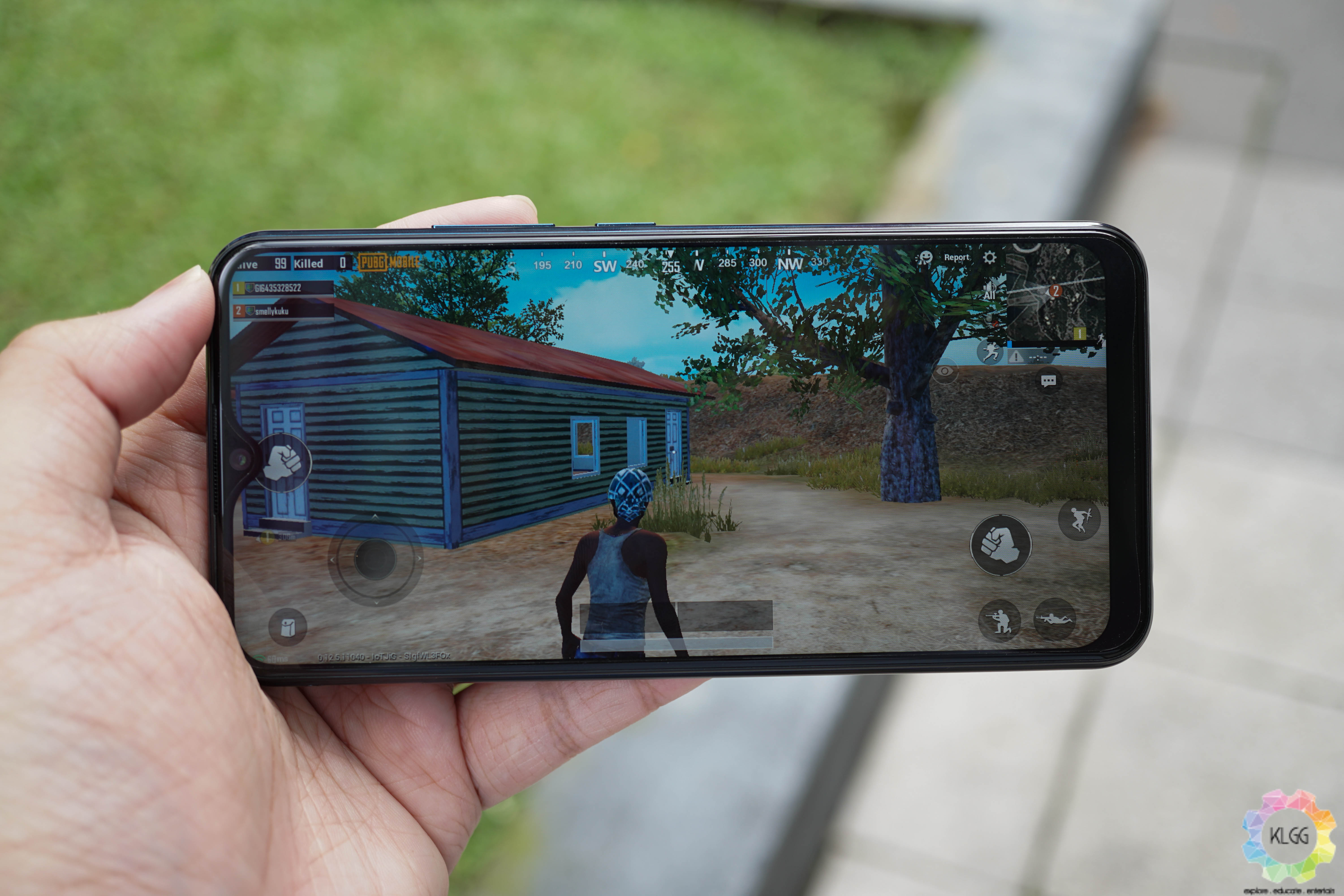
The Vivo Y17 doesn’t handle graphically intensive games well as you may already expect; PUBG: Mobile had to be played in low graphics settings; and even then, I’d get stuttering. You should be able to play less demanding games just fine. However, the phone stays relatively cool even after about an hour of gaming – which I was impressed with.
The phone also comes with 4GB RAM and 128GB internal storage, which is standard – and with this memory configuration, the Y17 is slightly cheaper than its competitors.

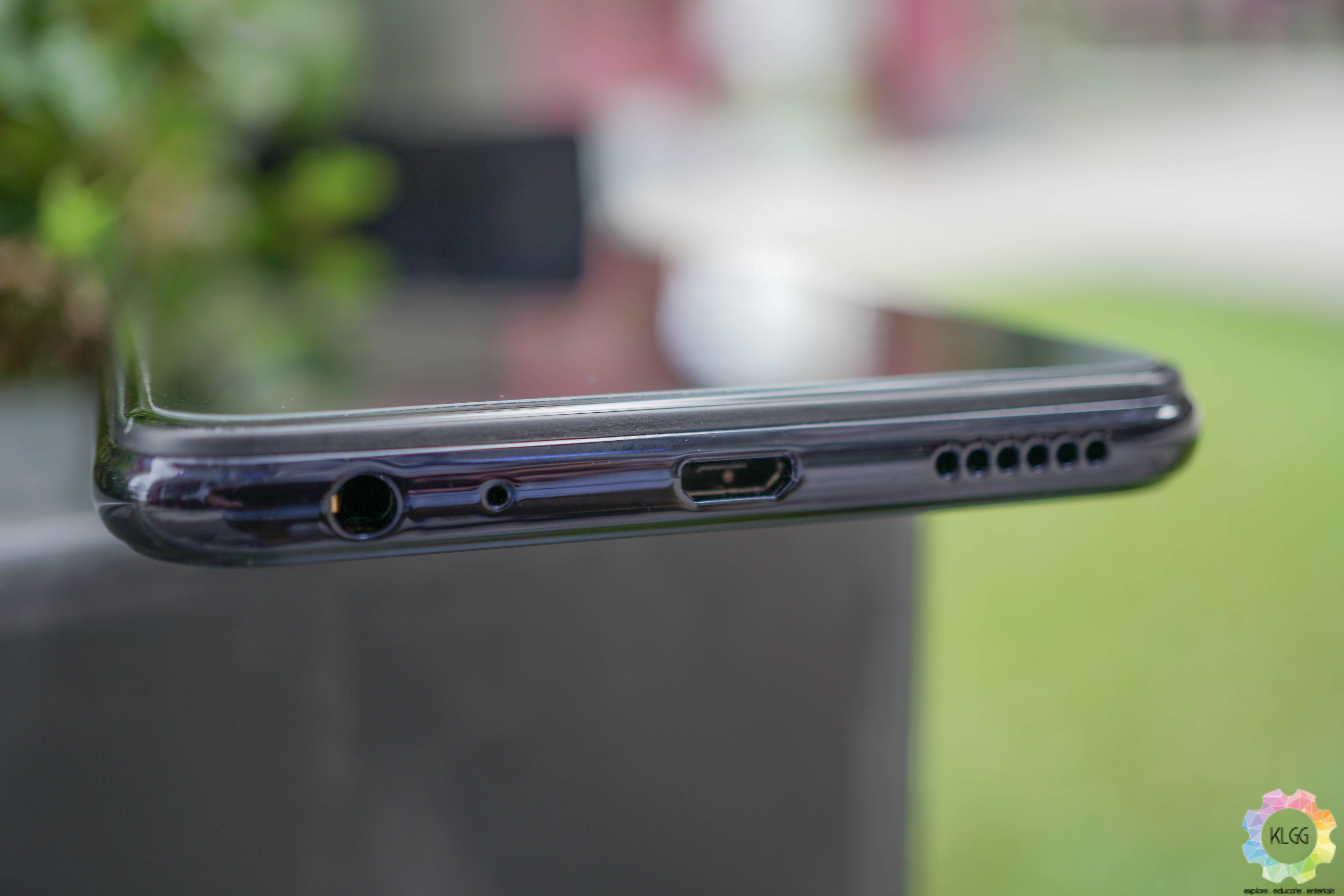
Now here’s what the Vivo Y17 is all about – its 5,000mAh is the reason why the phone is thick and heavy; but it will last you an entire day of videos, browsing and gaming with still some juice left just before your next charge. The phone supports 18W DualEngine fast charging via microUSB, and we were able to get a full charge in a little over an hour, which is fine for a battery this large.
As standard with Vivo, the Y17 ships with Funtouch OS 9 – it’s a hit or miss with some folk, my only gripe with it is that it lacks an app tray, no big deal. It also needs to be mentioned that the phone supports face unlock as well as fingerprint unlock.
With about a two weeks of using the Y17, I have to report that the phone just doesn’t live up to its RM999 price tag, especially when you consider its competitors such as the Realme 3 Pro and OPPO F11 are priced similarly and leaps and bounds better.
Verdict
At the end of the day, what should influence your final decision should come down to the phone RM999 price tag and whether it’s a worthy buy for that kind of money. I look at the Realme 3 Pro as well as the OPPO F11, and I say that you’re better off opting for either one of these alternatives.
At the time of writing, both phones are now priced below RM1,000 – the Realme 3 Pro 4GB + 64GB variant is priced at RM899 and has a faster chipset, while the OPPO F11 is now priced at RM999 and is leaps and bounds better than the Vivo Y17.
If you can spare about RM300, we say you could also go for the Vivo V15 – we’re saying this because Vivo can make good phones, and the V15 is a testament to that. Regardless, the Vivo Y17 falls short of its hefty price tag and could only be recommended to someone who really needs the large battery it has; and if you’re that person, you can get the Vivo Y17 can be purchased on the Vivo official online store for RM999 and is available in Mineral Blue and Mystic Purple.
The Good
- Impressive battery life
- Decent charging speed
- Bright display
- Decent photography performance
The Not So Good
- Poor performance
- Uninspired design
- Pricey for its class
- Hit or miss Funtouch OS 9
- Outdated microUSB port

