As the launch of the PlayStation 5 draws closer, Sony teases everyone by revealing the console’s UI. Their blog post details its aesthetics and functionality.
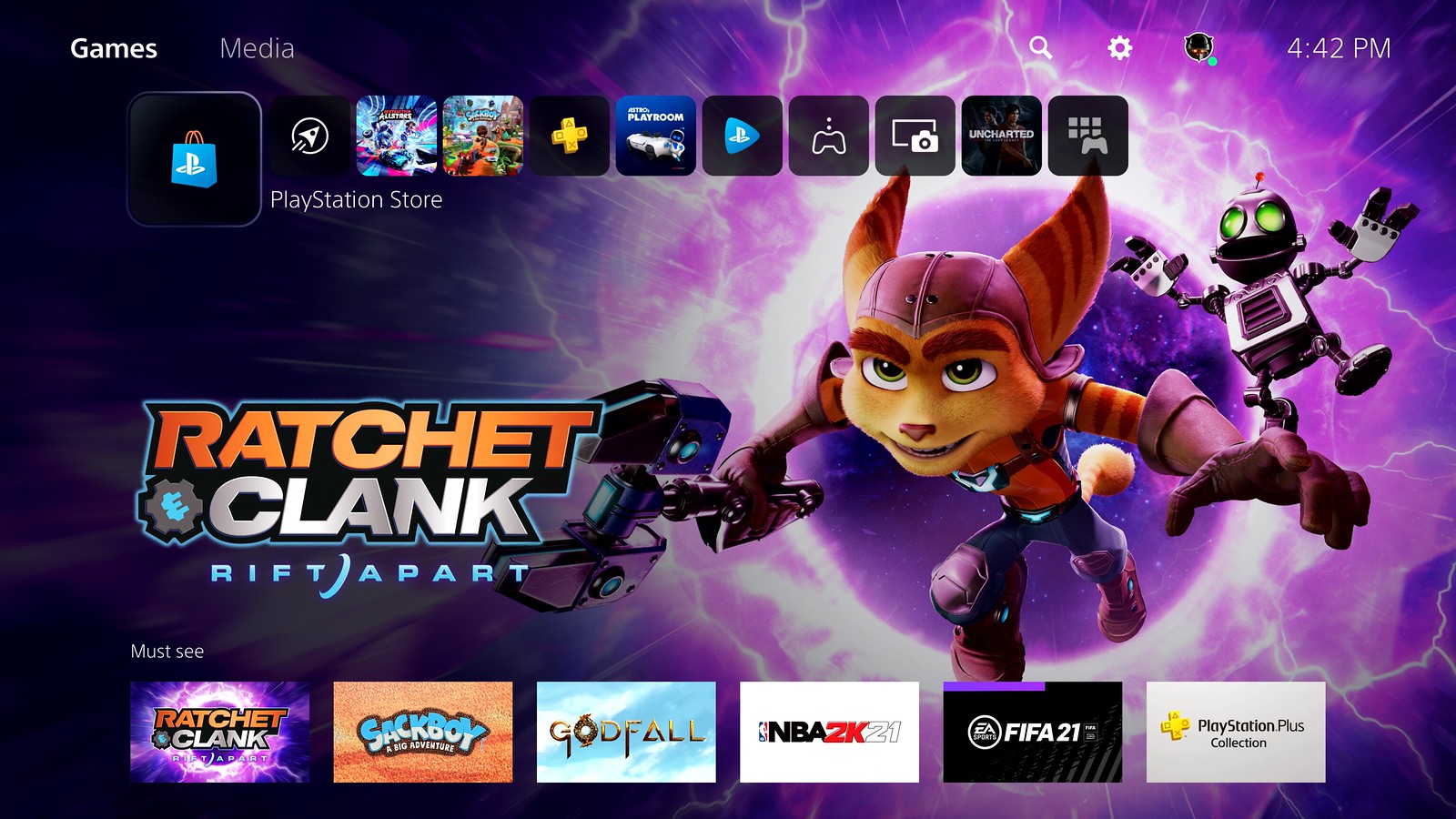
Starting with the home screen, you’ll see a more or less familiar layout with quick access to your recent games, the PlayStation Store, and more. The background will still show a game wallpaper of your choice. There are two tabs now – Games and Media.
When you hover over a game, you’ll be able to see certain info like activities, screenshots, and game news. GSMArena notes that this feature also works on PS4 games.
To open up the PlayStation ecosystem to the users, there’s an Explore tab that gives you info about your games and even news on the PlayStation hardware.

Image credit: PlayStation
GSMArena also notes that the PlayStation Store is now integrated into the OS and not a separate app, so there’s no boot-up time when accessing the store.
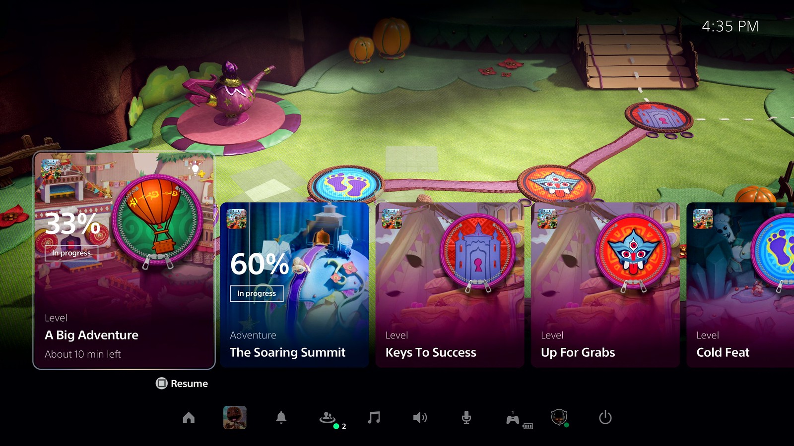
Another new feature is the Control Centre that allows you to get options for switching games, access notifications, view your friends list, and more. Added to the Control Centre are cards that show you game progress, recent screenshots, and more.

Image credit: PlayStation
When it comes to social features, your friends can now share their game session that you can view using picture-in-picture mode while you’re also in-game. Video capture now supports 4K resolution and can be shared on social media.
So there you have it – the new PlayStation 5 UI doesn’t look drastically different, but rather it improves on the PS4’s with new features to improve accessibility. The console will be released this November 19 and it’s safe to say everyone’s excited.


