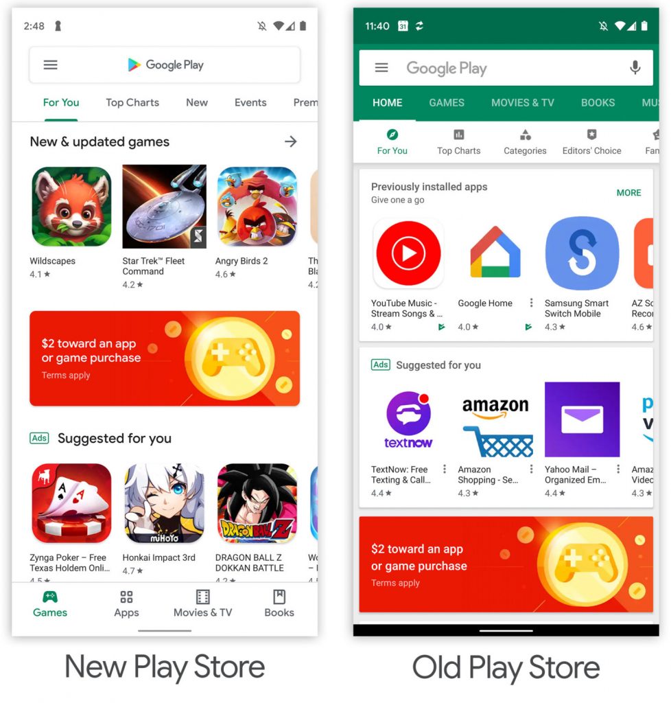
Sooner or later, your Google Play Store will be getting a major redesign that makes the store less colourful and more monochromatic.
The redesigned Play Store will remove its colourful headings — green for Games and Apps, pink for Movies, blue for Books. Instead, it will be all-white so it resembles Google’s homepage. However, you’ll still get the remnants of the old design because the colour of the categories’ fonts and the icons remain pink, blue and green accordingly.
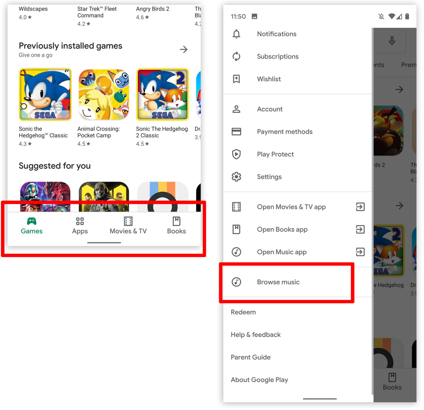
In addition, the different tabs will be relocated to the bottom of the app while the music tab will be moved to the sidebar. Speaking of the sidebar, Google Play Store will have a new tablet UI that place the navigation tabs in a sidebar. Arstechnica mentioned the importance of the new UI since foldable phones might a common device used by many in the near future.
Although the new design hasn’t been reported to support Dark Mode, it is possible that Google already has plans to introduce Dark Mode to Google Play Store, hence the removal of colourful designs in its UI.
Get real time update about this post category directly on your device, subscribe now.


