Overflow buttons are an Android staple – its three-dot icon has become synonymous with the ‘right click’ on a computer, allowing you to view more options for action.
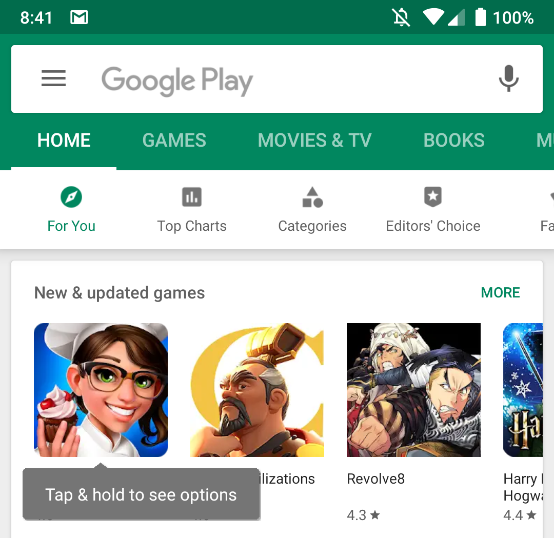
Google however deems this unnecessary in the pursuit of aesthetics. Google Play will gradually roll out an update that replaces the app overflow button with a ‘tap and hold’ gesture.

Image credit: 9to5 Google
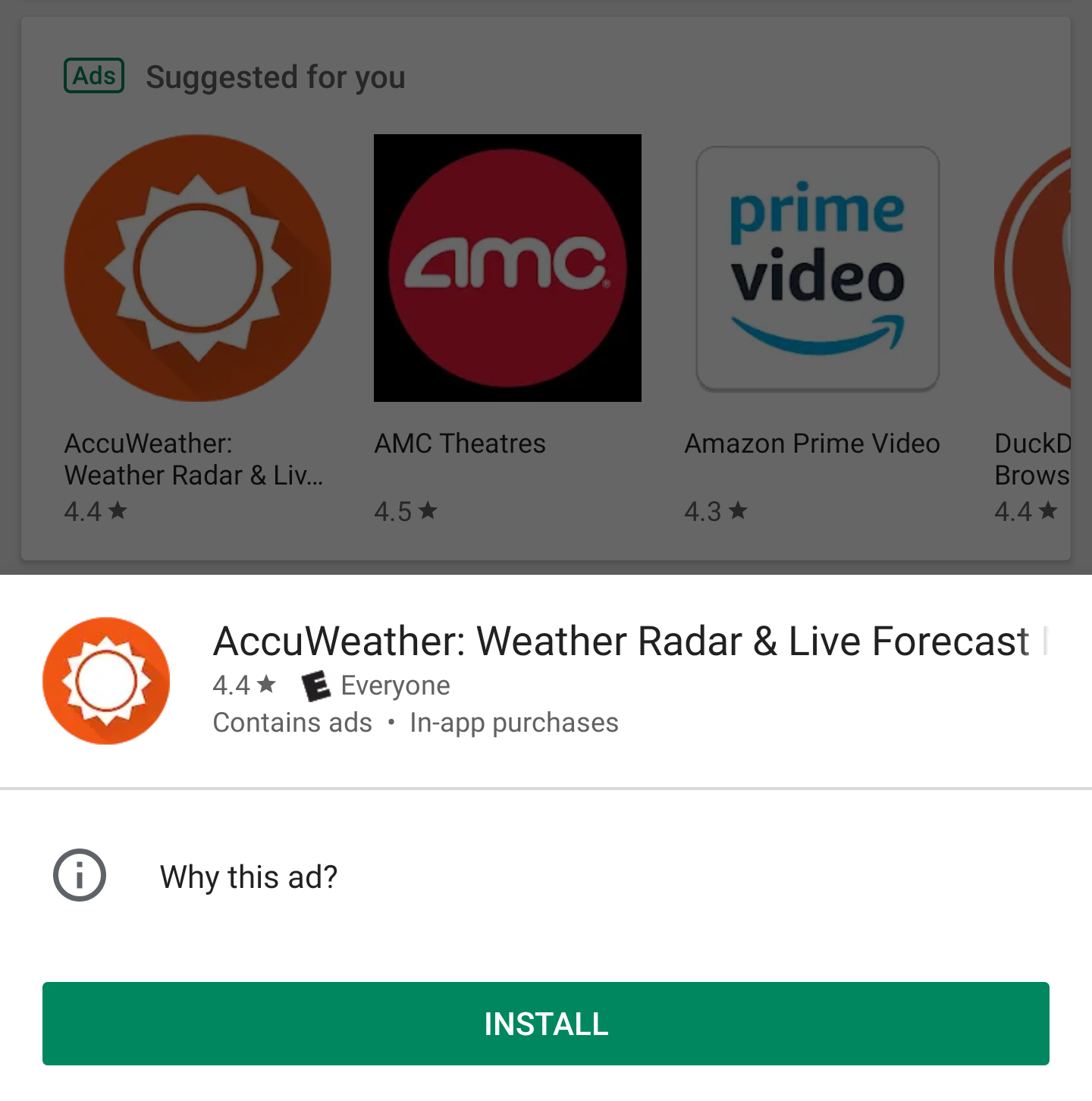
Images show that, upon implementation, the Google Play UI does appear cleaner, even only at the slightest bit.
According to 9to5 Google, the tap and hold gesture will bring up a menu which will display shortcuts for installing and purchasing options, as well as app details like review ratings, name and more.

Image credit: 9to5 Google
It took me long enough to teach the folks at home how to use an Android, and it seems like a follow up lecture is due thanks to this update – no dad, you don’t double tap on apps to open them!

