Facebook has come a long way from when it first started. If you take a look at the social media platform’s interface from 5 years ago you would probably hardly recognize how it looks. That is how much Facebook has changed in terms of its design and it has once again received a bunch of minor revamps for improved readability and easier navigation.
In a Facebook newsroom post, the company has announced that it will be making a few updates to its design over the next couple of weeks. One of the changes will be how conversations look in the replies section of Facebook posts. The style of comments have been switched up in order to make it easier to view which comments are to who.

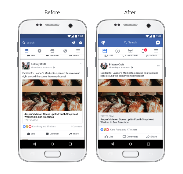
The News Feed will look slightly different from how it does now. Facebook has redesigned the icons ever so slightly, also increasing the color contrast to improve readability. Icons such as Like, Comment and Share have also been enlarged to enable easier tapping, along with circular profile pictures.
Other updates include a more prominent back button and being able to see where a link takes you before clicking on it. Instagram is currently changing their replies section to be more Facebook-like, so it is no surprise that Facebook will be undergoing some changes as well.

