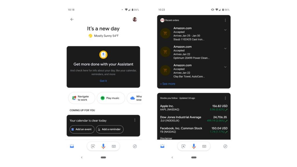
Dark mode has become an increasingly popular mode as it can be better for users’ eyesight especially when it comes to night time, which is why Apple introduced the dark mode in MacOS Mojave and Google Chrome has extensions for its users to switch on the dark mode. Now, Google is rolling out a new dark mode for Google Assistant on Android, but it doesn’t seem to be a job well done.
Google’s new feature for the Google Assistant is the dark mode cards that can be used to display the Assistant cards, but it’s not a complete dark mode, which defeats the purpose of dark mode itself in the first place.
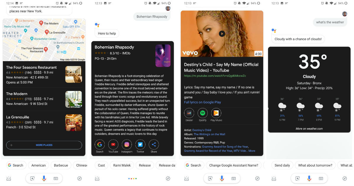
While the Assistant cards can be switched into dark mode cards, the background remains white which causes the whole screen to look like a combination of dark and light, which looks like an incomplete dark mode. This means that even if users are using the dark mode, they’ll still have to bear with the blinding white background thanks to Google’s weird update on the dark mode.
That being said, the company is rumoured to be working on a system-wide dark mode for Android devices, which could mean that you can generally use your smartphone in dark mode no matter which app you’re using. Maybe then Google Assistant’s dark mode will be greatly improved. For now, let’s just hope that Google will fix this inefficient dark mode and and introduce a better version of it.

